


|
References, Tools, Frameworks & Operating System used. |
||
| Items | Links | |
| Windows 10 or 11 | Download Windows 10 (microsoft.com) | |
| Visual Studio 2019 or 2022 | Visual Studio: IDE and Code Editor for Software Developers and Teams (microsoft.com) | |
| Uno Platform Project Template | Uno Platform Solution Templates – Visual Studio Marketplace | |
| Mac OS | macOS Monterey – New Features – Apple | |
| Uno Platform Documentation | Uno Platform documentation | |
| UWP Documentation | Windows Controls and patterns – Windows app development – Windows apps | Microsoft Docs | |
In the previous articles of this series, I looked into data persistence, back up and restoration across devices using SQLite as a database on one drive as a backup and restoration facilitator. This article will be more UI focused. It will discuss ways you can visualize the invoice and client data using adaptive styling on UI elements and layouts. I’ll be addressing two key areas in UX development:
1. Styling
2. Layouts & Controls
1. STYLING
This is a blueprint that defines design standards for a collection of UI elements and interactions. In the demo Uno Platform application, I made use of ThemeResource and Merged Dictionaries to create styles for individual UI elements, dark and light themes.
In the Microsoft XAML space, ThemeResource provides a means for obtaining values for XAML attributes that are defined in XAML resource dictionary at runtime. In Uno platform, we can use the XAML markup ResourceDictionary.ThemeDictionaries to create special dictionaries with a similar key but different values. This results in a different look based on the application systems theme. In our demo app we declared two resource dictionaries, one for the light theme and the other for the dark theme, each dictionary declares a list of colors with similar key name pairs but different hex color codes as values. When the app is run in a device with a light theme, the application loads and the colors in the light resource dictionary are applied and vice versa for the dark resource dictionary.
These colors can be used to provide background, foreground and gradient coloring to the UI elements. The images below show the effect on a dark themed device versus a light themed device:

UI ELEMENT STYLING
In order to unify the styling of a group or collection of UI elements think text-block, textbox, button etc. you would need to create a resource dictionary and declare styles that targets the specific element. The code snippet below illustrates this perfectly:
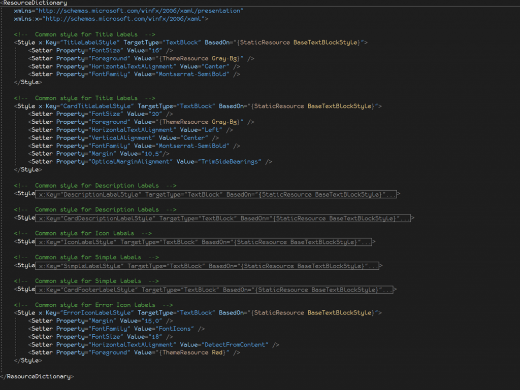
By declaring styles for different UI elements in a different XAML resource dictionary, you can reuse your code and ensure a uniform look throughout your application. In the demo app, I created several styles for text-blocks textboxes buttons etc. to be used throughout the application and for different purposes. The styles folder in the demo application shared folder houses all resource dictionaries used. To make sure all other parts of your codebase have access to the resource dictionaries created, you need to merge them in the App.xaml file as shown below:
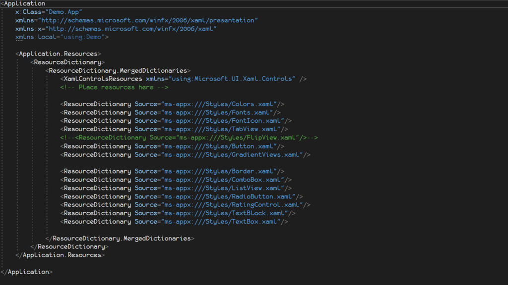
Please note, if you want to use other resource dictionaries like the Material UI in your app, you will need to merge it in the same way as shown above.
2. UI LAYOUTS & CONTROLS
With different screen sizes comes the need to efficiently and effectively utilize the screen real-estate to visualize data. A vertical scrollable list view of items on a mobile phone efficiently and effectively utilizes the available screen real-estate however, this most likely isn’t so for a desktop screen which would most likely benefit from a Grid view that can take advantage of the extra width that comes with most desktop devices.
Uno platform leverages WinUIs GridView, Visual State Manager and Adaptive Trigger capabilities to give developers the ability to create responsive and adaptive UIs. The implication being; if you want a page to display a vertical list of items in iOS and Android and a grid like collection of items arranged horizontally and vertically in other platforms this is possible. The Invoices, Clients and Settings page of the demo application illustrate these features in different ways.
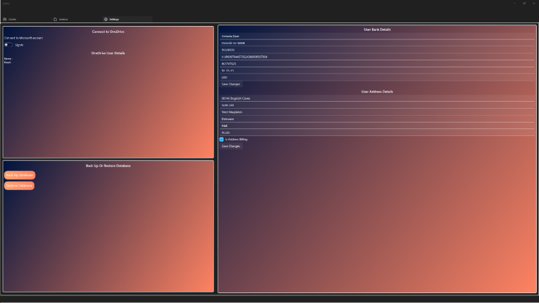
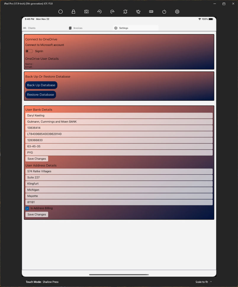
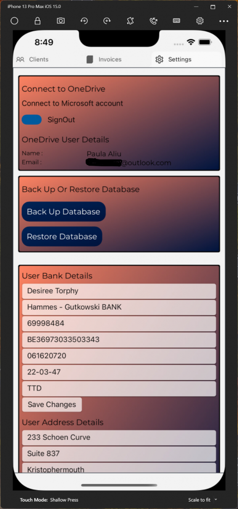
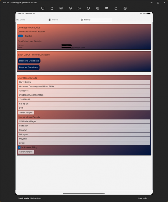
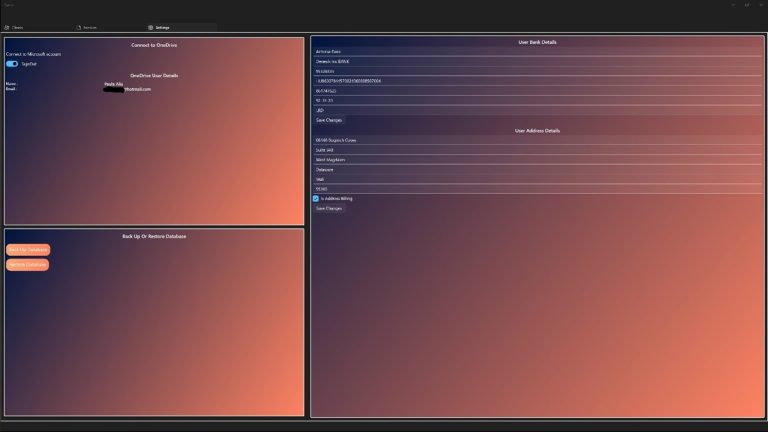
A. SETTINGS PAGE
This page uses a Grid to display and arrange its content. However, by defining the Visual State Manager, Groups and Adaptive Triggers, the placing of content differs, and this is determined by the width of the screen. For screens with smaller widths, the contents are stacked vertically and encapsulated in a scrollable view. For larger screen widths (Widths equal to or greater than 641 pixels as set in the code base), the content is arranged horizontally. The code snippet below illustrates the configuring of Visual State Groups to set contents in rows and columns based on minimum width and the subsequent images shows the resultant UI for iPhone, iPad and UWP:
<VisualStateManager.VisualStateGroups>
      <VisualStateGroup>
             <VisualState x:Name="WideState">
                  <VisualState.StateTriggers>
                        <AdaptiveTrigger MinWindowWidth="641" />
                  </VisualState.StateTriggers>
                  <VisualState.Setters>
                        <Setter Target="msGraphPanel.(Grid.Column)"
                                Value="0"/>
                        <Setter Target="userDetails.(Grid.Column)"
                                Value="1"/>
                        <Setter Target="userDetails.(Grid.RowSpan)"
                                Value="2" />
                        <Setter Target="msGraphPanel.(Grid.RowSpan)"
                                Value="2" />
                  </VisualState.Setters>
            </VisualState>
            <VisualState x:Name="NarrowState">
                  <VisualState.StateTriggers>
                          <AdaptiveTrigger MinWindowWidth="0" />
                  </VisualState.StateTriggers>
                  <VisualState.Setters>
                          <Setter Target="msGraphPanel.(Grid.Row)"
                                  Value="0"/>
                          <Setter Target="userDetails.(Grid.Row)"
                                  Value="1"/>
                          <Setter Target="userDetails.(Grid.ColumnSpan)"
                                  Value="2" />
                          <Setter Target="msGraphPanel.(Grid.ColumnSpan)"
                                  Value="2" />
                  </VisualState.Setters>
            </VisualState>
      </VisualStateGroup>
</VisualStateManager.VisualStateGroups>
B. INVOICES & CLIENTS PAGES
These pages uses the Win UI layout element GridView to visualize the collection of invoices and clients in the appropriate page. the GridView is an adaptive layout element suitable for visualizing a collection of items in rows and columns. In the declaration of the GridView’s ItemsPanelTemplate in the codebase, I modified the maximum rows or columns property for the GridView to cater to a specific platform’s need. Hence, iOS and Android could be set to 3 and non-mobile platforms retain the GridViews default values implying but they will wrap items when they approach the end of the width of the screen. the images below illustrate the invoices and clients’ page for iOS, iPad and UWP:
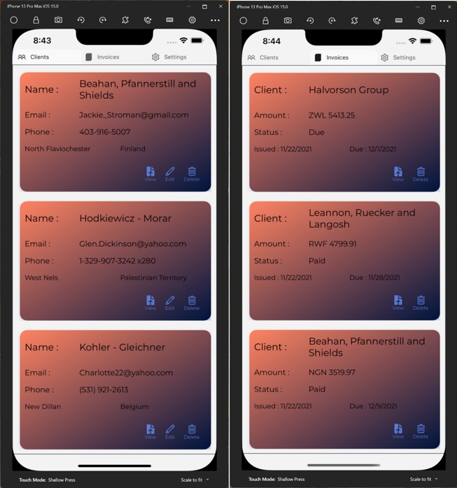
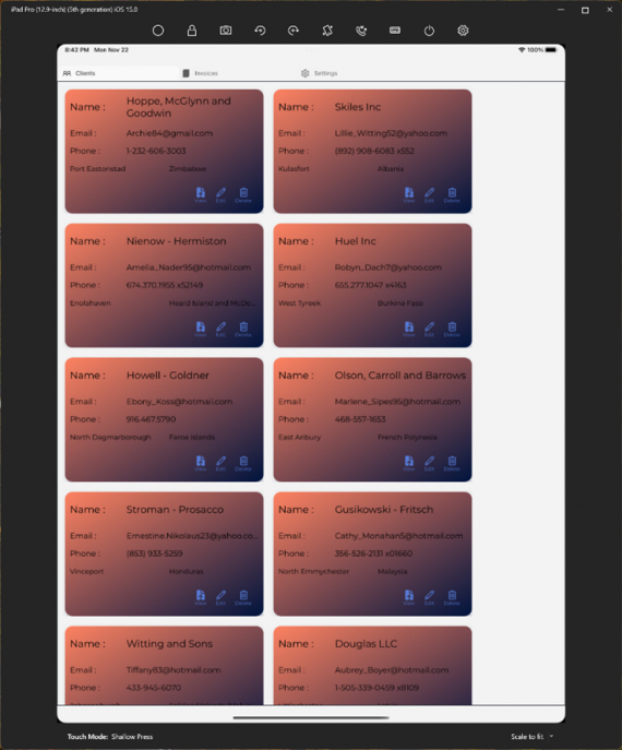
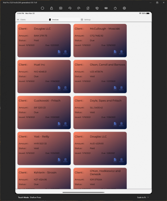
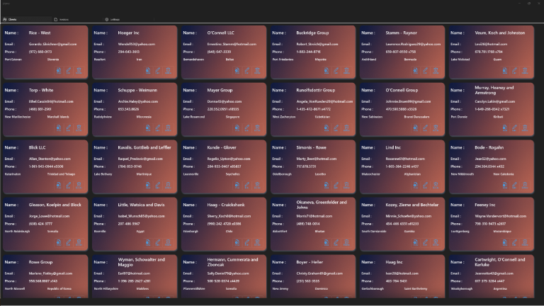
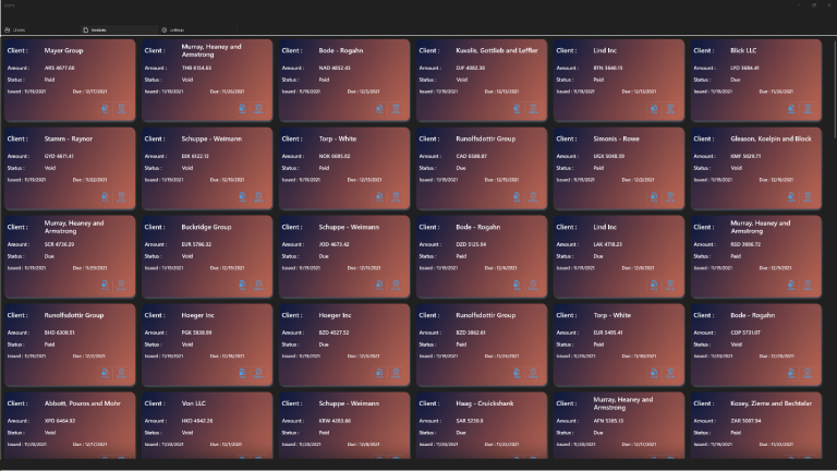
Each invoice and client record was represented using Uno Platform’s ElevatedView UI control as a data template to create cards that will hold the data of an invoice or client record in their respective pages. The ElevatedView has several customizable styling properties that can be modified to suit your needs: Shadows, Elevation, CornerRadius etc. In styling the ElevatedView, I used the Win UI’s AcrylicBrush to provide a nicer look to the individual cards and a the Win UI’s LinearGradient to provide contrast between two distinct colors. The demo application uses the TabView to provide a base page layout that makes navigating across pages easy.
If you are new to Uno Platform, the best way to get started is to follow our official Getting started guide. If you have questions, feature requests, or issues about using Uno Platform, you can find our engineering team on Discord – Channel #uno-platform, check out our GitHub discussions or you can also check out other available Uno Platform training options.

