
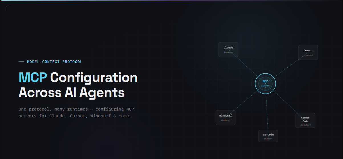
🕓 5 MINAn exploration of how various AI Agents read MCP tool configurations
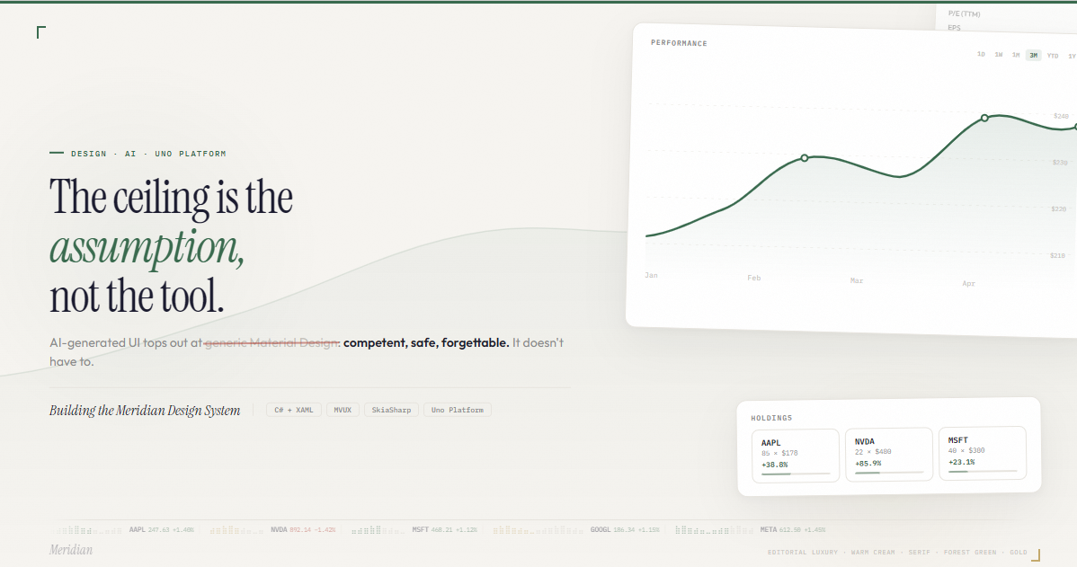
🕓 6 MIN11 interaction patterns, motion principles, and design decisions behind a financial dashboard built with Claude, C#, WinUI 3, and Uno Platform.
🕓 5 MINThe Windows Community Toolkit team on rebuilding for WinUI 3 with Uno Platform