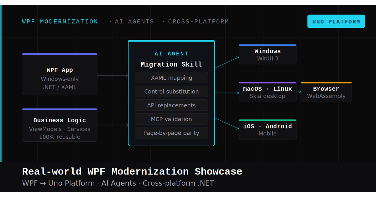
🕓 7 MINAn inside look at modernizing a WPF app to a modern .NET cross-platform Uno Platform app with AI.
We’re pleased to announce the release of the third preview of our Figma plugin, a faster and more efficient way to produce your applications! The Uno Platform for Figma plugin now includes parameters that accept user overrides, shape support, and auto-layout optimization. If you haven’t tried it yet, here’s how to go from Figma design to XAML code in a few simple steps. Let’s unpack this preview.
About Uno Platform for Figma
Uno Platform for Figma lets you create high-fidelity designs in Figma, then easily export your Figma design into clean, responsive XAML code. The result is a more streamlined design-to-development handoff which significantly boosts app development productivity. The resulting code is clean and easy to understand, so developers can build upon and extend it quickly.
Overrides
While talking to designers and developers using Uno Platform for Figma Preview 2, we noted a desire for greater flexibility regarding overriding component properties defined in the design system.
Now, as of Preview 3, users can set property overrides to components giving users the flexibility they want to customize components to suit their new context or explore iterations of a design.
Suppose your design uses a consistent set of buttons, yet you need to create a unique style for a particular use case. In that case, the plugin will detect the overrides you applied to instances and generate the proper XAML to reflect this new button style.
Swapping Color Roles
Overrides give you, as a designer, more control and flexibility in swapping color roles. As of Preview 3, overriding color properties is now made easy. For foreground colors, users can switch any color roles assigned to button labels and icons; for background colors, users can change the Primary and surface fill colors with different color roles from the toolkit.
Another element to highlight is that overriding the color of components has become a little easier because color, stroke, and elevation properties have all been moved up to be defined on the first component level. That’s a small but welcome change, as users can now make modifications without digging into layers.
Note: Right now, users cannot create custom colors. That’s something that we are working towards in the next version.
Stroke (Border)
Adding strokes (borders) is easier than ever; overrides now let users swap button border colors with other color roles from the toolkit. Add, remove, and edit border thickness from instances.
Adjusting Corner Radius
Overrides also allow you to redefine corner radius values set in Uno Toolkit components. You can now define custom corner radius values for color and stroke size.
Override Documentation
For a complete list of components supporting overrides or how to use instance overrides, check out our override documentation here.
AutoLayout Optimization
In Preview 3, we’ve moved AutoLayout out of the experimental stage. With this option enabled, the redundant AutoLayouts are removed in the resulting XAML, making for a less verbose, more readable, and more performant XAML code.
Shape Support
We’ve added shape support to all the necessary shapes and basic forms users need: users can now include polygons, ellipses and paths to their designs and generate fully reliable XAML code from Figma.
Productivity Boosters
Along with some of the notable productivity boosters listed below, the Uno Platform for Figma plugin itself is built with Uno Platform. We dogfood our own OSS Project! The performance gains in Preview 3 come as a result of all the work that went into Uno Platform 4.5.
Better detection of used components
Ability to customize the page name in the generated output
Major performance improvement with XAML generation
Added Support for:
Non-uniform corner radius
Text Alignment
StatusBar properties
Bug Fixes
Some notable bug fixes:
Mouse-clicking issues in the text editor are now working correctly.
Some unsupported designs were producing internal errors preventing XAML from generating.
Content for IconToggleButton was inverting the generated content (checked content was the unchecked one and vice-versa)
FAB in BottomTabBar is no longer masking other page content.
Ready to improve your designer-developer collaboration?
There you have it. You can quickly go from your Figma design to a fully functional, developer-friendly XAML code using Uno Figma. This boosts productivity for designers and developers alike. Spend more time designing, innovating, and coding and less time going back and forth.
If you’d like to see the code in action or check out some of Uno Figma’s other cool developer features, check out our e-commerce app, inside Figma, and navigate to Example App inside Uno Platform Material Toolkit.
Download Uno Platform for Figma plugin and Uno Platform Material Toolkit
Want to learn how to build pixel-perfect multi-platform applications with C# and WinUI? Get started
Tags:
Share this post:
Related Posts
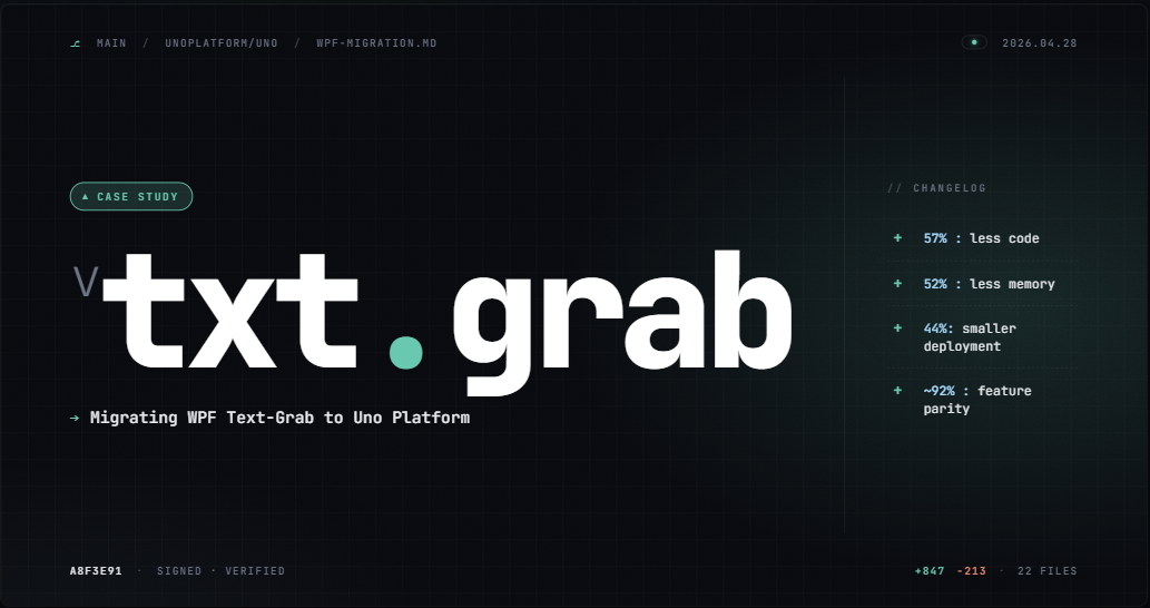
🕓 7 MINWhat actually happened when we ported a real 15-window WPF OCR app to Uno Platform: 57% less code, 52% less memory, ~92% feature parity, and the patterns that didn't survive
🕓 6 MINSkiaSharp 4 is around the corner - the biggest update to SkiaSharp in years. Along with the .NET teams at Microsoft, Uno Platform will co-maintain SkiaSharp going forward, making cross-platform rendering accessible to all .NET developers.


