

It’s 2022 and XAML on the Web is now as relevant on Mobile and Web as it traditionally was on Windows Desktops. Between 2005 and 2013, Beatriz Stollnitz authored a series of blogs that covered a variety of XAML fundamentals and became a treasure trove of resources for developers. As you can imagine much of the information has since become outdated and most of the code samples no longer work out of the box with the latest version of Visual Studio. Last year, Nick Randolph, an Uno Platform contributor, revived the almost 10-year-old WPF blog series on his .NET Travels, and we’re picking up where he left off. In this continued version of XAML Basics, we added a focus on Web and Mobile where XAML is now very applicable. We carry on the efforts of making the adjustments needed to bring each control up to date as well as provide equivalent examples that work to include XAML cross platform support via Uno Platform and WinUI to Web, iOS, macOS, Android and even Linux!
ListView
A sizable benefit which came during the early days of WinRT XAML was the refreshed ListView and GridView controls. Microsoft engineered these controls to be smooth & performant on relatively low-end hardware. Even today, ListView embodies a go-to solution for two developer challenges. Besides great performance, it offers an easy way to both display and interact with very large amounts of data in your application.
In this article, you’ll get a concise overview of how binding works, why it’s useful, and we’ll explore the properties on ListView you need to be aware of when binding data.
With XAML, you can design your apps to incorporate a data source without having it tightly coupled to your app UI. This way, you specify data for a control by setting the ItemsSource property. The ItemsSource property enables the control to bind to your data source. The data source you have beforehand should ultimately be a collection of objects. It is desirable to have this collection type implement INotifyCollectionChanged so the ListView control receives item addition, removal, and refresh notifications. ObservableCollection is the recommended option for most cases.
At this point, the control now has enough information to create and display a standard item container for each data item in your collection. These aren’t exactly helpful because you’ll notice they won’t display any item properties or custom UI. To customize the contents of the rather useless default container, you need to set the ItemTemplate property on ListView. You can accomplish this by specifying a DataTemplate, which is simply a way to customize the visual structure of your item. We can even specify this inline (code below).
Looking Briefly at {x:Bind}
{x:Bind} is the markup extension that easily creates a special object that transfers data values from a source you specify to the target. Microsoft, in their documentation, advises developers choose {x:Bind} over {Binding} because it, “runs in less time and less memory than {Binding} and supports better debugging.”
Finally, we have all the information needed to create a ListView bound to a data source.
<Grid>
      <Grid.RowDefinitions>
             <RowDefinition Height="Auto"/>
             <RowDefinition Height="*"/>
      </Grid.RowDefinitions>
      <TextBlock Margin="12" FontSize="22" Text="My Friends" FontWeight="SemiBold"/>
      <ListView Grid.Row="1" ItemsSource="{x:Bind MyItems}">
             <ListView.ItemTemplate>
                 <DataTemplate x:DataType="local:ListedItem">
                        <Grid>
                              <Grid.ColumnDefinitions>
                                     <ColumnDefinition Width="*"/>
                                     <ColumnDefinition Width="*"/>
                                     <ColumnDefinition Width="*"/>
                              </Grid.ColumnDefinitions>
                              <TextBlock Grid.Column="0" Text="{x:Bind Name}"/>
                              <TextBlock Grid.Column="1" Text="{x:Bind Occupation}"/>
                              <TextBlock Grid.Column="2" Text="{x:Bind Age}"/>
                       </Grid>
                </DataTemplate>
             </ListView.ItemTemplate>
       </ListView>
</Grid>
This is great, but what if we wanted to make the data more readable by alternating the background color from one row to the next? Let’s go a little further.
Going further with ListView
You can optionally handle the ContainerContentChanging event to adjust your items’ ItemContainer by yourself. In this case, we handle the event and determine the Index of the item, setting the background to an alternating color based on it.
<ListView ContainerContentChanging="ListView_ContainerContentChanging"
...
private void ListView_ContainerContentChanging(ListViewBase sender, ContainerContentChangingEventArgs args)
{
            if ((args.ItemIndex + 1) % 2 == 0)
            {
                args.ItemContainer.Background = new SolidColorBrush(Colors.LightGray);
            }
}
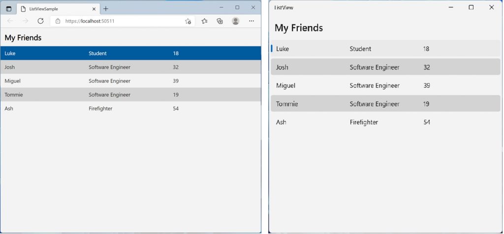
Finished Product
It really is that simple to display your data in a way users will appreciate. With the .NET runtime having recently improved their support for WebAssembly by leaps and bounds, there couldn’t be a better time to leverage Uno Platform & ListView to build a high-quality application powered by the Web.
Next Steps
For your convenience we’ve made the code sample available here. Explore our samples and discover how you can Get Started with Uno Platform to build your desktop, mobile and web apps.

